Facebook advertising is growing, it has not stopped growing since its inception and it shows no signs of slowing anytime soon.
The reason for this is simple; nearly everyone uses Facebook, and it remains the perfect place to advertise where everyone frequents at some point, as long as the ads work. Making it work is the trick however, and doing it wrong is far too easy. Here are our tips to take you through 2016 and beyond making Facebook Ads which actually convert.
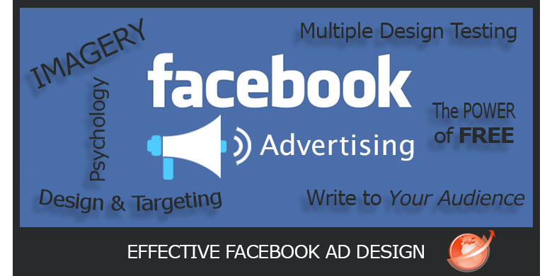
Design & Targeting
There are two main parts of Facebook advertising; the design and the targeting. These two things may just be THE most important part of your entire advertising campaign, because if either are done poorly then the ad will fail. If you consistently post punchy designs and target audiences with microscopic perfection, you can bet it will show in the amount of people who click on your ad.
Multiple Design Testing
Facebook has this incredible ability, one which no other social media mogul shares: the ability to focus in on people to such a fine degree that you can be sure you’ve targeted someone who will be interested in what you’re selling. It is for this reason especially, that you need to test many different designs for the same advertisement. Keep the wording the same and change photos, text within the photo, try multiple photos, or even video, but keep the words the same. Test all of them and see which ones perform the best. You will soon see which elements people tend to resonate with, and can repeat that. For instance, using a real person in an image as opposed to a cartoon depiction of a person or otherwise, performs up to 70% better. You can tell these sorts of things by looking at your ‘Cost per Click’.
Write to Your Audience
This goes right along with targeting, because you’re going to write and design an ad which appeals to both men and women, young people and older people, and cross any other barriers to the idea that this product or service is only for one type of person. A man would rather see another man working hard in an ad, who is sweaty but the ad says he smells great and isn’t feeling overheated thanks to his deodorant. That same deodorant brand selling to women may picture a woman in a sauna with the same sort of wording. The two ads will perform better because the audience they’re meant for are part of the ad itself. If you’re looking to get the attention of a Fortune 500 company, you’ll want to use few words, big design, and have some sort of testimonials from other giants in the industry. If you are advertising to small businesses like the Mom and Pop store on the corner, then you would rather go with something that appeals to family, using elements like wood, warm colors and a photo of a family enjoying whatever it is you’re selling. By writing to your audience, you increase your chances that your ad will perform well.
PRO TIP : Be conversational in your posts when trying to create engagementThe Proof is in the Pudding
People like when someone else has proven something to be worth doing, having, eating etc before them, because it takes the fear out of the risk. People are fearful of losing money and don’t want to be foolish and make a bad decision, which is why shopping online can be so hit and miss. If they are not confident in what they’re spending their money on, it is not likely to happen, so give them proof! Find someone famous to give you a testimonial – you can even offer your service or product to this person free in exchange for a testimonial if they like it. Sometimes you may end up having to pay the person for their time to do so but it is worth doing if people recognize that person, and are able to believe in your product or service because “Mr. X” does. You can even do it without testimonials by using the accurate user base you have in numbers, like telling people, “Fyco, 670,000 business clients and growing.” or asking people to join the growing number of people using your product. Having proof takes away the fear factor and gets people excited to try your product or service. They figure if someone, or that many someones have tried your product or service and loved it, then it has to be good.
Find. Create. Save. Measure.
Your social media campaigns from a FREE TO USE dashboard OR
Let us save you time by creating content and posting to your social profiles for you
All About the Imagery
Facebook’s Newsfeed is really cluttered, there is so much going on at any one point in time that it can be easy to overlook or totally miss something altogether. The key here is to create an image that is noticeable instantly. The best way to do that is to use starkly contrasting colors like red on white, or yellow on black. You can also apply colorful filters to your image. What you want to do is draw the eye to your ad and then capture it long enough to rouse curiosity. Using the right images really matter.
The Psychology of Advertising
Facebook knows their users, probably far better than we’d like them to, but wouldn’t it be great if we could know them the same way Facebook does? It would be lovely sure, but you don’t have to scrape data to know how to market to your many different types of people in your audience. Appeal to their rational and emotional parts of themselves. Talking about product features will satisfy the rational mind, but it doesn’t satisfy the emotional level at all. To cater to a person’s emotional side, talk about what benefits they will get from your product or service. Saves time, makes you happy, calms the mind, these are all things which fit the emotional aspect. A good ad combines the rational reasoning with the emotional reasoning, and follows it up with proof to cement the power of the ad. It will talk about the benefit you’ll get, then talks about the features, goes back to emotional when saying it can make you happy or more relaxed, then goes to rational speaking again when mentioning that there is no risk, and lastly – that ten million users cannot be wrong. Emotional and rational reasoning on every other line of the ad, and ending with proof. That makes for a wonderful ad that is powerful psychologically.
More Psychology in Advertising – COLOR!
Research has shown that older people prefer blue, green, and purple while younger people are into yellow, red and orange. However, most people of any age seriously hate the color orange, followed by purple, yellow and brown as “least liked colors” according to research by Joe Hallock. You can use color in a few different ways. If you’re targeting a younger population use those colors which are more loud and vibrant. If you’re catering to the older crowd however, use more muted colors and darker cooler colors. When you think about the logos of the biggest companies out there today, like Google, or EBay, Windows, or the US television company NBC, their bright rainbow logos come to mind. These colors appeal to everyone, and they are instantly recognizable. Color gives a brand it’s pop and gives people an awareness of the brand whenever they see those color combinations again. Color also can portray emotion, and is heavily used for those reasons to give warmth to an ad, or any other number of emotions. Gold or yellow is a stand in for optimism, clarity and warmth – think sunshine! Orange signifies friendliness, cheerfulness, and confidence – but don’t overuse the orange, people do still dislike it. Red is all about excitement, youthfulness and boldness. Purples are creative, imaginative and wise. Blue works for trust, dependability, and strength. Green is peaceful, and healthy and also signifies growth – think of trees, grass, plants. Grey is balance, peace, neutrality and calmness.
The Power of Free
You don’t have to give away your product or service, but if you do give something away for free, something of value whether it’s a tutorial on how to use something you’re selling, or an item you can get a lot of for very little wholesale to offer as an incentive, giving things away for free is great advertising. People LOVE free stuff, and they’ll always notice the word when they happen across it. Be easy with the word however, you only want to use it once or twice, any more than that and it looks cheap and not worth getting. One well-placed use of the word “free” is all it takes to get you noticed.
Face Forward
Facebook is named for this very thing, and with good cause. There are cells in our brains which only fire when we see a face, and they light up like a night city skyline trying to recognize the person, or compare them to others we’ve seen before. People also see faces in everyday objects like on stoves or toilets, even armchairs that look happy or smiling. People are tuned in to faces, and they’ll always look at them. It seems silly to ignore the phenomenon by using something else, but then if you’re doing multiple testing you’ll know which do the best faces or no faces!
Wait! Urgent! Read this!
You read this part, and would have read this part due to the urgency of the heading. We fear we’ll miss something important or hear something critical so we wait for whatever it may be so we don’t lose out. People do not like to lose anything… ever. If they’re offered something for a limited time, they’ll want to get it before it’s gone if it is worth having. We appeal to their fear of loss, they don’t want to lose out on this awesome deal before it’s gone, so we push that fear to get them to buy before it’s gone. Fear of loss is a much harder thing to push these days however, since in an e-commerce world, people know they can get whatever they want nearly anytime they want, so to create fear of loss, a discount must be huge, or a special has to be extraordinary in terms of what is on offer. Use scarcity (there is not much of this left) and urgency (get it before it’s gone) and watch the results soar!