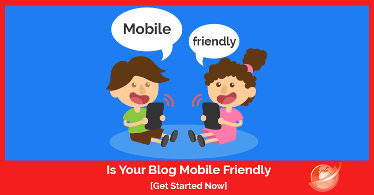
More people access content using an e-reader app on either a phone or tablet than ever before. If your blog or site isn’t mobile-friendly and ready to be read on any size screen, this article is the perfect first step.
Starting with Stats
We’re kicking this off with some serious stats because nothing moves people quite so much as actual proof.
- Over half of all Google searches are done from a mobile device. (source)
- Close to a BILLION people access Facebook ONLY using a smartphone. (source)
Using only this data – which is compelling enough given the size of both companies, and coupling it with humankind’s serious addiction to tech, it’s long past time to consider going mobile-friendly. There really is no reason not to be mobile-ready at this point in time. Not having a mobile-friendly site will run away more people than it will bring in and unless you can afford to lose the business, you’ll want to read on.
Late? But not TOO LATE
Way back in 2015, Google rolled out an update for mobile users to get a better experience, they saw the writing on the wall and were not about to let an opportunity pass them by. A good rule of thumb is if Google’s done it – you should too – even if it’s early and looks like nobody else has jumped on board, Google’s not called an Oracle for nothing.
After their update went live, sites which weren’t optimized for mobile use were penalized for it, and far less traffic came their way. Their rankings were also affected because this was around the same time that Google got rid of all the people trying to sell SEO as a business. They took offense to the fact that people could claim “Page 1 rankings” as something to sell, and they squashed it flat.
Some sites are mobile-friendly as a standard like WordPress and Weebly to name a few, but there are still some themes out there which are stubbornly resistant to mobile, so making sure is something you need to do. Just access your site from a tablet or a phone and see how it looks. If you must use your fingers to enlarge the screen or to push tiny buttons, then it’s not mobile friendly and needs an update.
Responsive Layout
It’s Dangerous to go Alone, Here, Take This!
Google hasn’t left us high and dry though, and while this next bit is slightly more complicated for the average site owner or blog owner, it’s incredibly helpful and allegedly helps site ranking, though Google won’t admit it. It DOES remain their baby, however, so one could safely assume that it would only help them to promote sites which use it.
Google has a feature nicknamed “AMP” which stands for Google’s Accelerated Mobile Pages. This feature automatically helps a site and its pages load faster on mobile devices, which contributes to a better UX. Google also features a mobile-friendly test tool you can use to see very quickly if your site works well on mobile, without a lot of hassle.
Facebook’s even gotten in on the same ideas, with their own spin of course. They have a feature called Instant Articles but the catch is, you must first sign up as a publisher with Facebook. It’s not hard, but requires that you submit some sample articles first. (source)
User Experience (UX) and Mobile are BIGGEST Factors
Google isn’t done messing with sites which aren’t mobile-friendly, they’re also looking for those sites which aren’t delivering a great UX. Ux stands for “user experience” and is one of the largest things that Google wants to improve for its users – especially with all the hard feelings of late toward tech giants. If you want to guarantee better rankings, you really need to deliver.
Focus on things like mobile navigation and menu tools, which go to links that are active, and working not broken. Make sure that PageRank flows nicely as well.
- DO NOT make your site navigation a big multi-tiered list – it doesn’t work for mobile well and looks cluttered and old-fashioned.
- Consider that the average mobile screen is only 720 pixels wide at the widest point. This means everything on your site needs to be drastically trimmed down to fit. Even a paragraph can look like an overwhelming wall of text on mobile, but look perfectly fine on a computer screen. Limit your mobile navigation to 8 items at the VERY most, but aim for 5. This saves you from losing people due to decision paralysis. (read more)
- List only the most important “headline” information people want to see most and keep it short.
- Consider what your most important pages are, then ask people who don’t work for you what they’d find most important in your industry or from your business if they were a customer. Remember that what they think is what your potential clients will think and take that advice as golden.
- Keeping it short and sweet also means that it helps Google crawl the site easier for indexing, which is a win for SEO as well as UX.
- Remember that people are having to scroll constantly to read a longer article but they don’t want to do that endlessly. Try to include a TL;DR at the top (Too Long Didn’t Read) which is a well-known internet abbreviation to give people a summary of the content so they know if they even want to read it.
- List navigation links to the headings of each section so they can quickly jump to the area of most interest if they like, saving time and scrolling.
- Search needs to be there for ease of use.
- When thinking about how to get people to the most important parts of content on your site, consider the fact that the search function is the biggest and best thing to include – and it needs to be clever/intuitive. Amazon has given JUST a search function, opting not to clutter a person’s screen with menu options because obviously, they’re there to shop and most often they come with something in mind.
- Design based on touch – assume everyone has the finger pads of a giant.
- It’s incredibly difficult for anyone with big hands to operate a tiny screen as it is, and these days nobody gets by without needing to use a phone to access the internet even sporadically. By assuming your average user has the hands of a giant, you’ll be accommodating every size of finger pad out there, and not risk losing people to frustration and anger they’ll associate with your site not getting them where they want to be when the wrong thing gets pushed.
- To help avoid this, try not to put buttons or links too closely together, so people get exactly where they want to be the first time they push the button.
- Don’t use complicated fonts that are difficult to read.
- Not everyone is a native English speaker, and even for those who do speak English as their first language, some fonts are incredibly hard to read including any of the fancier once which use cursive or script. Tiny text is also bad, and some fonts just come tiny as a standard, so make sure you test it out on the smallest mobile screen you can find to ensure it can be read even at the smallest it can be.
Google Says
Thus, each time the width of a text block grows past about 10 words, consider adding a breakpoint. (source)
Closing Points
DO NOT clutter someone’s tiny screen with too many pop-ups they must close using a tiny ‘X’ in the corner, it’s annoying and will drive people away. It also slows down your site’s load time, and that will drive GOOGLE away. That’s a big problem. If you insist on pop-ups, limit it to one at the start, and perhaps one as they intend to leave. NO more than that.
UX matters more than ever, and too many ads will cause your page ranking to fall drastically because nobody wants to deliberately and obviously be targeted by marketers. Google even rolled out an intrusive interstitial penalty for sites which block the screen’s content on mobile entirely with an interstitial ad. (source)
Awesome Resources
For extra tips and tricks on becoming mobile friendly – look no further, we’ve always got you covered.


![Do you know BERT? [Google SEO]](https://magiwebsa.com/wp-content/uploads/2019/11/podvid-epi35-cover-500x383.jpg)