
Colours can move people, they certainly influence emotions, as proven by many a behaviorist over time – take the test at the bottom of the post to find out what type of marketer you are!
Red is associated with things like fire, and passion, where blue tends to be calmer, more peaceful and tranquil like water. How do using colours which evoke an emotional response work in marketing? Read on to find out.
Everyone Loves Neutral
Neutral paint tones for use inside and outside homes have been popular throughout time, even as fads toward Easter-egg coloured homes came and went. The earthy colours are warm, or cool depending on their base shade, and will influence people in different ways depending not so much on the colour itself, but its base colour which is warm or cool. Neutral colours work well with a ton of other more vibrant colours, so they’re a natural colour pick for large areas. Consider using these as a site’s background colour.
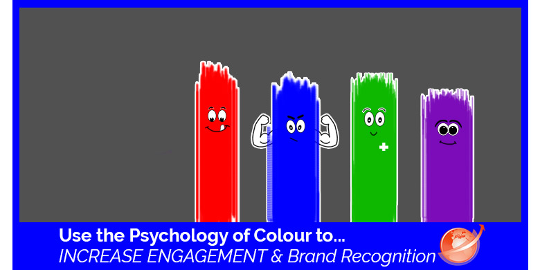
 Red Makes People Hungry

Red has long been shown to encourage appetite, and is used often by fast food chains. It also suggests urgency as with red signal lights, or red stop signs. People use red when they’re offering sales on clearance, and it’s also long been a symbol of movement, excitement and passion which is why flamenco dancers choose red for the dresses.
Red is a high energy colour and it instantly draws focus, nobody is immune to the allure of red. It’s physically stimulating, and actually changes bodily functioning by affecting nerve impulses, raising blood pressure and heart rate.
 Blue is for Men
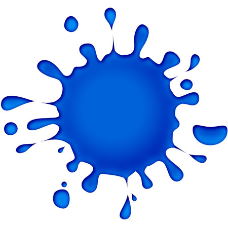
There is a strong and compelling reason parents opt for blue with baby boys, and that is because since time itself, men have preferred the colour blue. It’s associated most strongly with water, peace, reliability and steadfastness. It is a naturally calming colour that inspires a sense of security and brands use it to promote trust. It’s more of a gentle persuasion than with reds in your face approach. It is the most commonly used colour in offices and big corporate brands, and helps to calm the mind, bring about tranquility, and is often associated with maturity.
 Green is for Nature

Green is the go-to colour for health industries like hospitals and care centres thanks to its association with nature, tranquility and good health. It’s also strongly associated with money, wealth and brands capitalize on this in places like jewelry stores in the velvet backing or the signage of the store. It’s also used in stores to relax people, and is often used to promote environmental issues and to stimulate harmony. It helps to encourage decisiveness. This is the most common colour used in shopping carts for this reason.
Purple Means Wisdom
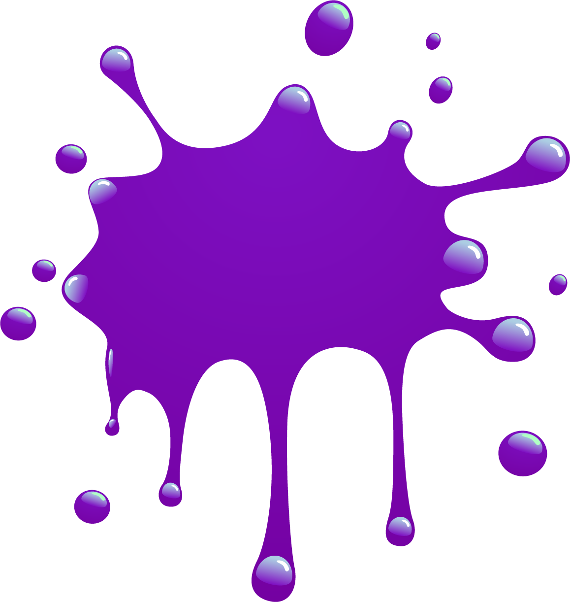 It also means royalty, and is associated with feelings of respect. It helps to stimulate the area of the brain responsible for problem solving, and also creativity. It is used most often to promote beauty products like skin care lines for older people, and it also helps to represent a brand in a way that shows wisdom and imagination. This is best employed when trying to sell an idea, or something that requires an open mind to go forward with.
STATS!
- 3% of people look at the texture of the product being offered. 1% decide based solely on smell or sound, and an overwhelming 93% focus on what it looks like.
- Appearance might well be everything to the browsing shopper. 84.7% of people believed that colour was the primary draw card to buying, 52% wont’ return to a store if they don’t like how it looks inside, and 80% believe that colour is absolutely responsible for brand recognition.
Orange and Yellow
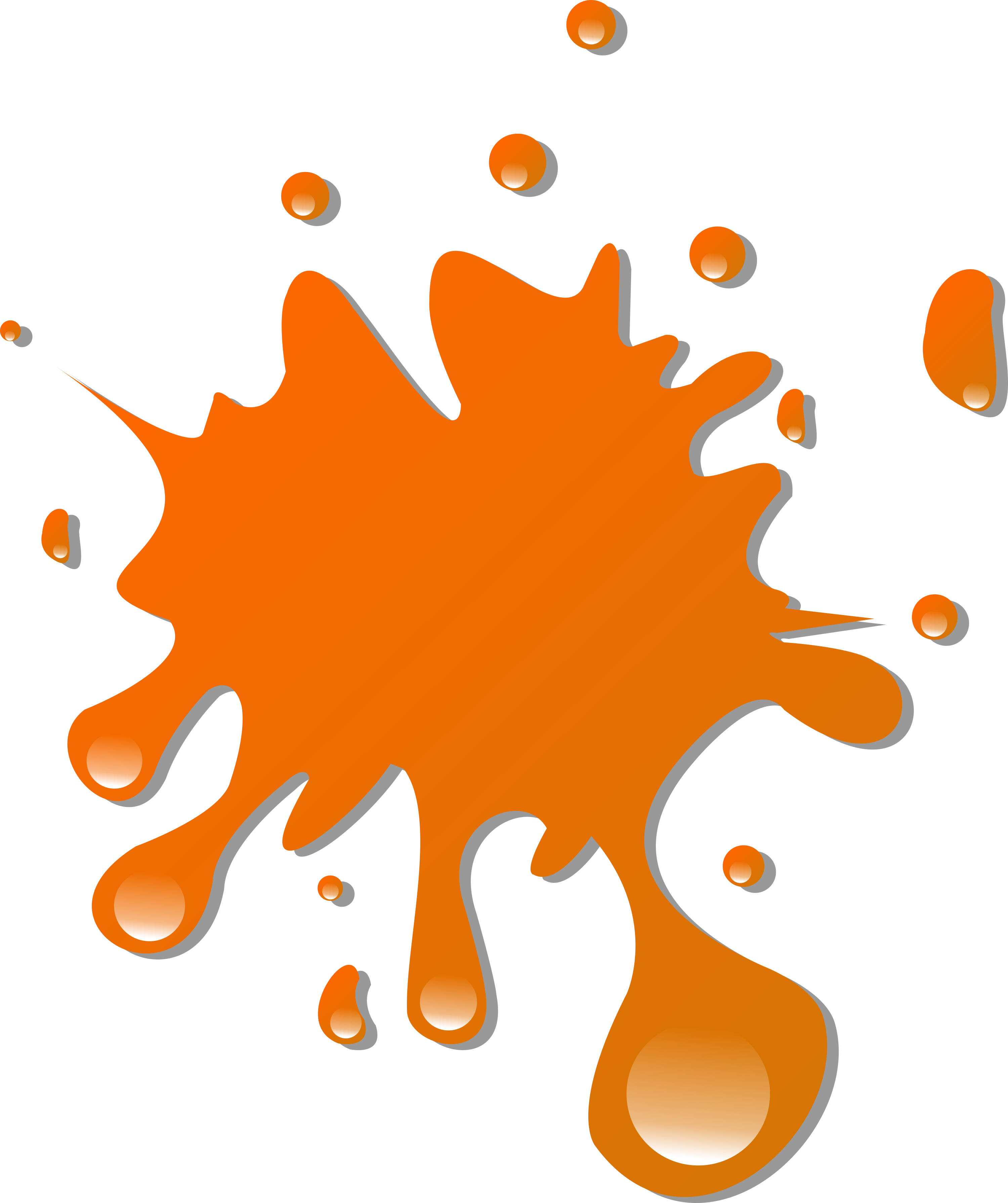 These are the two least favoured colours by people, but seem to work quite well in marketing. Both encourage cheerfulness and optimism, and orange is often used for caution as with road construction signage. It’s used in retail stores to draw customers in and make them curious, to stimulate impulsive decision making and it is shown to promote enthusiasm, but if it is used too much, it can create anxiety. So use orange sparingly.
Black is a Power Colour
Black stands for authority, power, strength, and stability and is often used as a symbol of intelligence. It’s used to promote focus, but dont’ use it too much because it gets overwhelming. Use it to punctuate something, not to BE that something.
 Grey is Sensible
Grey represents practicality, and it is absolutely the most timeless colour of them all. It also stands in for solidarity like a stone, but using too much can create feelings of apathy and bring about feelings of old age, death and depression.
White is Safe
If you’re just starting a brand or looking for a clean image, you can’t go wrong with white, and using enough of it. It is associated with feelings like purity, cleanliness, saftey and to spark creativity.
Cool, Warm and True Neutrals
Cool colours are calming, and can sometimes feel cold and impersonal so if you’re looking to draw someone in, you may want to opt for a warm tone. Warm colours are exciting, but can be overly stimulating, and can generate feelings like anger and violence. True neutrals are technically neither warm nor cool, and they go well with both. They’re a great way to mix up some of the harder to use colours that you can’t use too much of.

![Do you know BERT? [Google SEO]](https://magiwebsa.com/wp-content/uploads/2019/11/podvid-epi35-cover-500x383.jpg)