
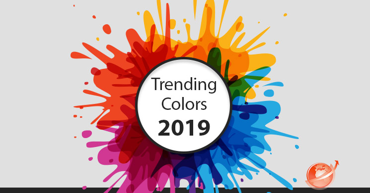
Many brands are locked into their color scheme for their logo, but they have plenty of room to play within their articles, posts, and other creative endeavors. Color is a large part of consumer culture, and every year, Pantone announces the color that sets the tone for the year to come. This year? “Living Coral”.
Pantone – Who? What?
Pantone is a leader in color printing primarily, but they do also have coloring agents for paint, fabric, and plastics. More importantly, they’re the Wizard of Oz for designers.
Predicting color trends is less what Pantone does, and more all at once. They are the ones who set the trend by announcing the color of the year, and designers love to use these colors, which then spawns trends in clothing and plenty of other industry thereafter.
Business and marketing is not excluded, and by using the trending colors within posts and articles, photos and more – you stand to capture a larger audience. If you’re interested to see what Pantone has done in past years and what it stood for, so were we. [view here]
Why it Matters
Maybe you’ll never wear anything from Burberry, or Prada. It doesn’t matter though, because those big brands give rise to plenty of knockoff brands which follow the trends of the first. People begin to see the color combinations so often that it conditions a response, especially among those who enjoy being trendy. Color isn’t something that advertises loudly, it works in the background and not in a way most notice or are aware of.
Consider how comfortable you are sitting in a room painted entirely the color you hate most. There are a few colors which are almost universally displeasing – apologies orange, and shades of brown and green best left undescribed.
Every year, Pantone changes the game by announcing the year’s color. Each year, the color has a political bend to it and is meant to inspire the coming year. If you’re being seen, it never hurts to be trendy.
This is a big one for image icon, Pinterest. Color trends are something they’re very great at covering thanks to their crowdsourcing, and many follow Pantone’s lead and have put together varying palettes around the coral shade.
There are numerous ways you can put this to use within your site and articles like using specific font colors or background colors, photos with specific color filters, title text in a trendy shade… the options you have are limited only by what you can imagine. Being trendy by using colors that are ‘hot’ seasonally, or yearly can help you capture a larger audience.
You can use Pinterest as your display board for the many uses you have for the trending color palette.
Adaptable
The great part about working trending colors into your marketing or advertising is that it changes with the times, which makes your brand feel fresh and exciting without having to tell people that you are, ‘fresh and exciting’! When you read, you generally read the words but don’t notice the colors you’re reading them on much unless it is hard to see, or irritating to look at.
More often, color is absorbed unconsciously as a feeling about something. Red tends to be more exciting or passionate, yellow is bright and cheerful. Green reminds people of being outside on a lazy summer day, and blue of the water and the calmness associated with it. When color is added to writing, it can help influence the reader without needing to use emojis. It’s a clever way to display your intent, without it being obvious.
Since color trends change with seasons and years, you can do the same thing and update your colors by matching them to the newest trends.
Go Easy
Your brand is you, and we’re not suggesting you rebrand yourself, or to paint your entire blog posts or articles in the trending colors. Use them here and there, and in combinations together that make sense. There is no need to go overboard with the color use because the whole point is for it to go seemingly unnoticed.
Don’t invest too much work or time into the new colors unless your business revolves around it, because it will change over time. Understanding how colors communicate with people is important, especially trending colors. These colors nearly imbue a person with popularity for using them in their wardrobe or company image. It all stems from the fashion designers, but that all comes from Pantone.

![Do you know BERT? [Google SEO]](https://magiwebsa.com/wp-content/uploads/2019/11/podvid-epi35-cover-500x383.jpg)